Tuesday, January 02, 2007

Money in the Market


 The chart above shows the portfolio position at the start of each month over the last year. The black line shows a cumulative average of the total cost of shares bought. Over the last 2 years I have had an average of $455,000 in the market based on the start of each month.

The dollars committed to the market have been relatively steady. I can use this average as a base for calculating a % return on realised trades. This method shows 31% for 2005, 21% for 2006 and (on unrealised or carried forward profits) 44% for 2007.

If I take the total dollars profit (realised and unrealised) for 2006 I would be up 65% at the end of 2006. But I don't think I should include open trade profits in the performance results.

Stevo

Saturday, December 30, 2006

Revised Yearly results


 Below I posted early 2006 results. I revised the charts above give a better picture. The last bar shows carried forward open trades. Even though 2006 could be considered down on previous years in terms of realised profits the open profits carried forward into 2007 gives a better idea of how good 2006 was. Profit factor is still over 3 at 3.34, including open trades.

Over the last year there has been quite a distinct accumulation / distribution pattern of profit taking. So the 2nd quarter of 2006 realised substantial profits. Profits have been building through the 2nd half of 2006. 

Don't ask me for % profits over the year. I added substantial capital late this year.

Let's see what 2007 brings.

Thursday, December 28, 2006

Time Frames


Time frame can be quite misleading - the chart above could easily be daily.

The chart above shows signals from a system I have been working on. I have stated I am a longer term trader - the chart shows monthly bars. What is surprising is that, as long as I can get in/out around the open of the following month, the system drawdown is quite low. If I use a random entry / exit price (as opposed to the open price) in the following month drawdown increases, but the results are still good enough to encourage me to make some trades using a monthly timeframe.

The system does use stochastics, as well as index filters, volume and a momentum indictator. Above 50 on the stochastic sets up a buy, below 50 triggers a sell. Stochastics, combined with RSI in a monthly timeframe can work quite well, although I am not using RSI in this system. But not in the traditional sense.

The bar colours are set by the stochastic to show the trend.

Stevo

Tuesday, December 26, 2006

Early 2006 performance


2006 was a good year, although I am jumping the gun a little since it is not quite over. 

Open and closed profits realised over $260,000, plus some dividends and bank interest. 
However $170,000 is in unrealised profits and will be carried forward into next year.

Realised profits were down over previous years, but nothing of concern considering the level of open profits moving into next year. A good year could easily be one where there are no realised profits because no sell signals are given and open profits are growing.

I made a slight loss in the last quarter, but adding an extra $800,000 to the portfolio is doing reasonably well, aided by the excellent market conditions.

Wishing all a merry Christmas and a happy New Year.
Stevo 

Friday, December 01, 2006

Bollinger bands


The chart above shows a nice bollinger band breakout on a weekly ERG chart. I am not in this trade and this is not an active system. I find this a more fruitful aproach than the traditional OB/ OS strategy commonly touted in trading books. I use this strategy to trigger buys in systems I trade. Combined with volume, momentum and a suitable exit it works quite well.

To quote from the Bollinger site;
"Price can, and does, walk up the upper Bollinger Band and down the lower Bollinger Band."

"Closes outside the Bollinger Bands can be continuation signals, not reversal signals--as is demonstrated by the use of Bollinger Bands in some very successful volatility-breakout systems."


Stevo


Sunday, November 26, 2006

% Profit frequency chart


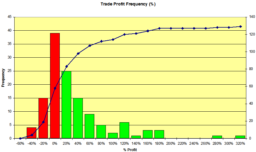
% Profit frequency chart for 129 trades to compare with the dollar frequency chart below. On startup of the system I was a little cautious in terms of position size so the % profits were not matched by the dollar profits!
Stevo

Saturday, November 25, 2006

Trading profit & loss - frequency of profits & losses


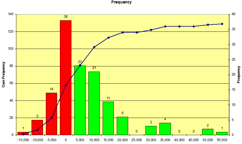
The chart shows the frequency of trade returns in dollars for my portfolio. There are a total of 129 trades in the results. Looking at the chart 38 trades lost between $0 and $5000. 58 trades lost money out of the 129. The results are based on portfolio status up to the end of October.
One trade lost more than $15,000 - a lesson about trading whilst on holidays and double checking everything. I got the position sizing very wrong with this losing trade and suffered more than double the loss I should have. If you trade more than one portfolio make sure you don't place an order in the wrong portfolio. Overall though the chart is nicely skewed in my favour.
HumbleMoney inspired this post http://www.humblemoney.com/?p=140
Stevo

Monday, November 20, 2006

One step forward and two steps back - the Market Tango

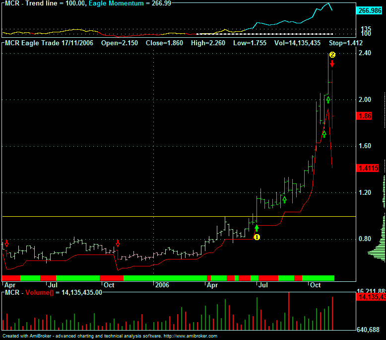
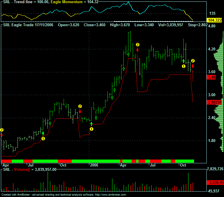
As usual when one puts more money in the market the market reminds me that it's not that easy. Both SRL and CEY are recent trades.


These 2 weren't too bad but the following one was unfortunate!

Resource stocks tend to move as one with commodity prices, although I like them in a portfolio as they can make substantial gains. One winner and 2 losers.

Stevo

Monday, November 13, 2006

JBH trade


This was a nice trade for the super fund. I exited 2 weeks back. When I buy the exit targets are set as shown by the upper and lower lines. I also use a lazy moving average. I only exit on the close which is why the system didn't exit earlier.

The system is designed for the ASX100 / ASX200 and whilst it doesn't give the sorts of returns as some other systems it is a nice system to trade. This trade returned around 43% plus dividends.

Stevo

Saturday, November 11, 2006

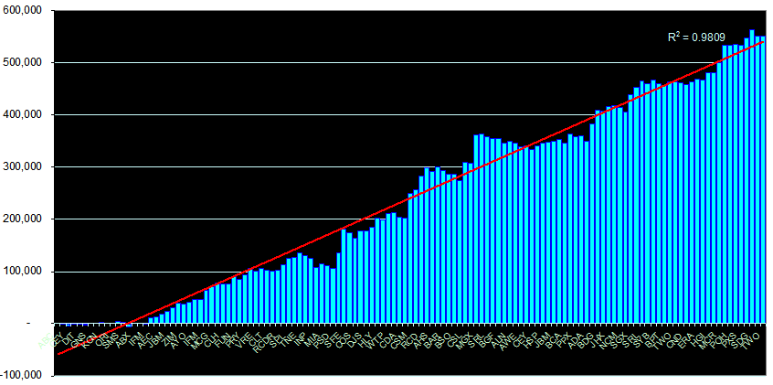
Trade Equity


I love the power of Pivot Tables in Excel. They allow me to extract all sorts of info out of StockMaster (the software I use to manage my portfolio). I often use more than one order to buy the number of stocks I need for a postion. By using Excel I can amalgamate the multiple orders using Pivot Tables to get the graph up to the end of October 2006. I have made 129 trades in this portfolio since Jan 2003. The last stocks on the graph are open positions and the R squared value is shown just because I can.

Obviously there are peaks, troughs and the odd flat period on the chart, but overall the direction, in a bull market, is in the right direction. As always I can only take what the market gives - and so far it is in a very giving mood.

The Aussie stock market is booming. Resource stocks are leading the way yet again and it looks like being a good year again. I have also just put another $800,000 trading capital into this portfolio.

Stevo