Sunday, November 26, 2006

% Profit frequency chart


% Profit frequency chart for 129 trades to compare with the dollar frequency chart below. On startup of the system I was a little cautious in terms of position size so the % profits were not matched by the dollar profits!
Stevo

Saturday, November 25, 2006

Trading profit & loss - frequency of profits & losses


The chart shows the frequency of trade returns in dollars for my portfolio. There are a total of 129 trades in the results. Looking at the chart 38 trades lost between $0 and $5000. 58 trades lost money out of the 129. The results are based on portfolio status up to the end of October.
One trade lost more than $15,000 - a lesson about trading whilst on holidays and double checking everything. I got the position sizing very wrong with this losing trade and suffered more than double the loss I should have. If you trade more than one portfolio make sure you don't place an order in the wrong portfolio. Overall though the chart is nicely skewed in my favour.
HumbleMoney inspired this post http://www.humblemoney.com/?p=140
Stevo

Monday, November 20, 2006

One step forward and two steps back - the Market Tango

As usual when one puts more money in the market the market reminds me that it's not that easy. Both SRL and CEY are recent trades.


These 2 weren't too bad but the following one was unfortunate!

Resource stocks tend to move as one with commodity prices, although I like them in a portfolio as they can make substantial gains. One winner and 2 losers.

Stevo

Monday, November 13, 2006

JBH trade


This was a nice trade for the super fund. I exited 2 weeks back. When I buy the exit targets are set as shown by the upper and lower lines. I also use a lazy moving average. I only exit on the close which is why the system didn't exit earlier.

The system is designed for the ASX100 / ASX200 and whilst it doesn't give the sorts of returns as some other systems it is a nice system to trade. This trade returned around 43% plus dividends.

Stevo

Saturday, November 11, 2006

Trade Equity


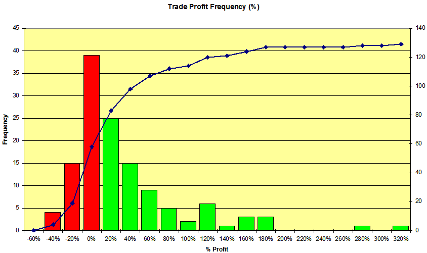
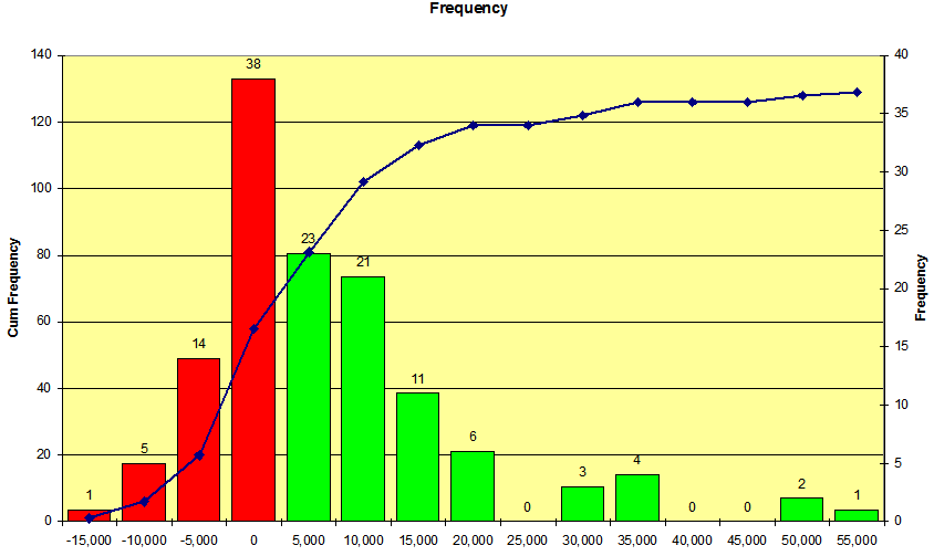
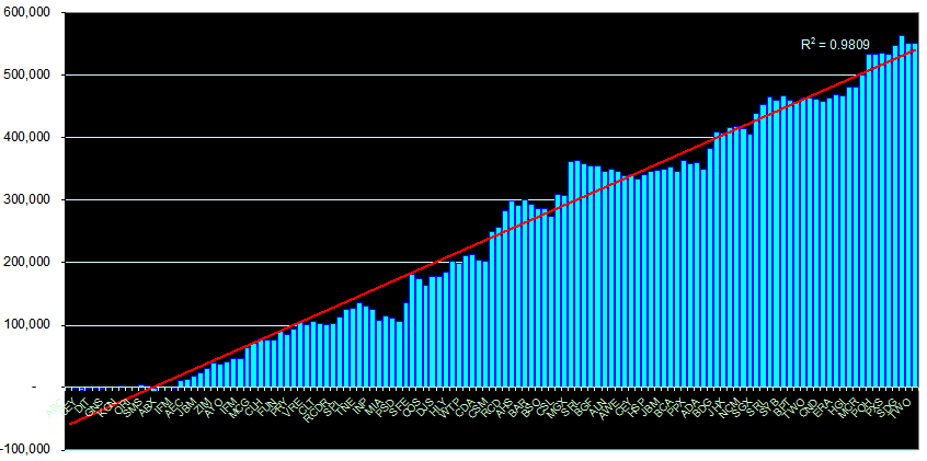
I love the power of Pivot Tables in Excel. They allow me to extract all sorts of info out of StockMaster (the software I use to manage my portfolio). I often use more than one order to buy the number of stocks I need for a postion. By using Excel I can amalgamate the multiple orders using Pivot Tables to get the graph up to the end of October 2006. I have made 129 trades in this portfolio since Jan 2003. The last stocks on the graph are open positions and the R squared value is shown just because I can.

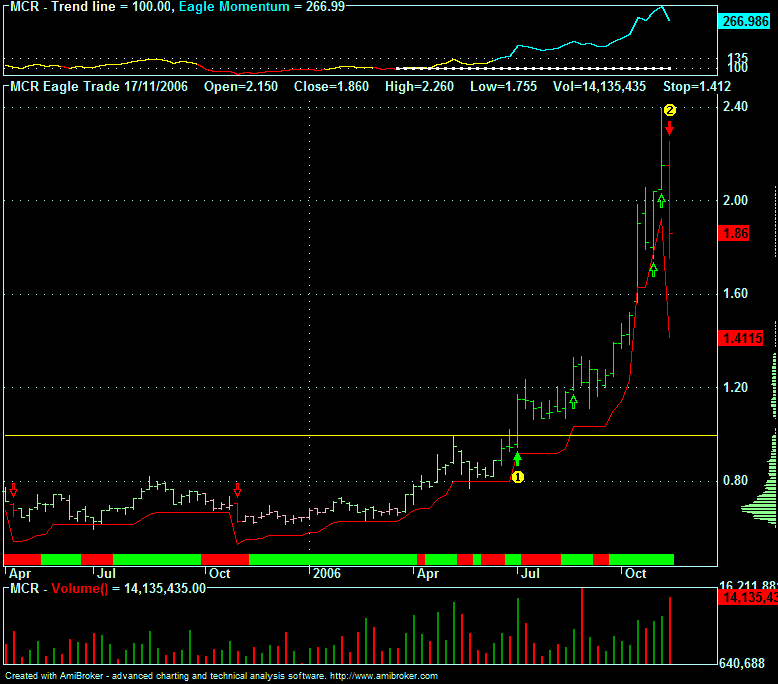
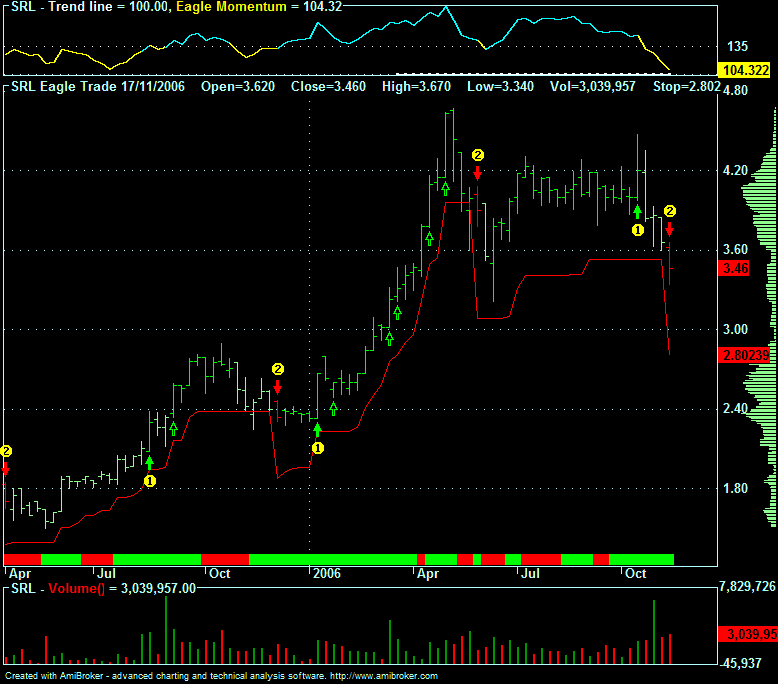
Obviously there are peaks, troughs and the odd flat period on the chart, but overall the direction, in a bull market, is in the right direction. As always I can only take what the market gives - and so far it is in a very giving mood.

The Aussie stock market is booming. Resource stocks are leading the way yet again and it looks like being a good year again. I have also just put another $800,000 trading capital into this portfolio.

Stevo